
Week 4: Visualization
“The simple graph has brought more information to the data analyst’s mind than any other device,” John Tukey, cited in Data Science in Context(1) p18
Goals
- Understand the importance of simplicity in visualization
- Learn basic principles of visualization
- Understand why the use case visualization has been successful
- Review examples of visualization failures
Keep the visualization simple
Evidence-based policy making means making decisions based on the best available evidence. But high-level decision-makers don’t have time to delve into the data – they rely on data scientists and analysts to provide the evidence in a way that can be understood. Visualizations are an important part of understandability(1), and they need to be short, clear, and tell the main story. Mark Twain famously said “I didn’t have time to write a short letter so I wrote a long one”, and the same goes for visualizations. Simply put, producing simple and clear visualizations to decision makers is an essential part of scoping and essential for getting high level buyin. It’s extraordinarily hard to do well because it requires (i) really understanding the level and interests of the audience, (ii) sifting through massive amounts of data to distill out the key points, (iii) making sure that you are telling the truth with that data and (iv) conveying complex ideas simply. READ MORE
Communicate the message
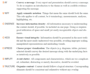
The SUCCESS formula of IBCS https://www.ibcs.com/ibcs-standards-1-2/
Once the analyst has decided on the key data points, the next step is to decide on how to map the data to visuals (often called aesthetic mapping). There are lots of decisions to be made, and there’s often not a single “correct“ answer. There is an enormous literature on which to draw and even a professional association – International Business Communication Standards (IBCS) – on professional business communication(2). The most basic concept to remember is that our brains are trained to seek order and structure (Gestalt!). Since we group terms with shared properties (color, size, structure, closeness), a good visualization signals quickly how like things should be grouped and often provides labels to reinforce the grouping(3). The SUCCESS formula in the figure provides a useful reference. From a practical point of view, decide on the geometric focus and then choose what plot type you want- NOT the other way round. READ MORE
Visualization basics

Every visualization can be decomposed into two different parts – marks and channels. Marks are the geometric primitives that represent items or links (points, lines, arrows). Channels are the visual representation of item attributes (position, color, shape or tilts). And then consider what adjustments need to be made to facilitate understanding such as scale transformations, how to deal with outliers, set limits on the coordinates. In the education-employment use case, the state agency staff knew that decision-makers were interested in the earnings and employment degree completers. The visual maps wages against the percent employed by major – carefully defining percent employed as 3 years post completion (telling the truth). The data primitive is the point for each major. The channel is the color which shows the different majors. In this case, blue shows the outcomes for education majors. The immediate effect of the visual is to show that there are very big differences in employment and earnings by major and that if “good majors” are defined by jobs with high earnings, health is a good major. Education is in the middle of the pack. What is compelling about the graphic is that it provides decision-makers with control. They can click on a circle to get more information about the major, and they can click on the filters to customize what they see. READ MORE
Visualization failure
The poster child for a failure to convey information well is the engineering presentation made to senior managers in the Challenger disaster. Tufte’s book and the chapter “Visual and Statistical Thinking: Displays of Evidence for Making Decisions” came out in 1997(4), but it has been called required reading for every student of science and engineering(5). The engineers had processed massive amounts of data, and knew that Orings were like to fail in cold temperatures, resulting in the catastrophic explosion of the Challenger and the deaths of seven astronauts, but the poor representation mirrored poor reasoning on the part of the engineers. READ MORE
Interim class presentation this week
Visualizations will be an important part of the class presentations. Make sure that your graph header summarizes the point of the graph and that there is one key idea per graph. Produce a maximum of three or four graphs and tables, and provide sources. And, of course, make the graph as simple as possible. The structure should follow the standard rubric: (i) Introduction and motivation (ii) Review of what has been done by others (iii) Data and Measurement (iv) Main results (v) Next steps
Readings:
Optional Reading: READ MORE
References
- Spector AZ, Norvig P, Wiggins C, Wing JM. Data science in context: Foundations, challenges, opportunities. 2022.
- Tufte ER. The visual display of quantitative information: Graphics press Cheshire, CT; 2001.
- Stokes C, Setlur V, Cogley B, Satyanarayan A, Hearst MA. Striking a balance: reader takeaways and preferences when integrating text and charts. IEEE Transactions on Visualization and Computer Graphics. 2022;29(1):1233-43.
- Tufte ER, Robins D. Visual explanations: Graphics Cheshire, CT; 1997.
- Tufte ER, McKay SR, Christian W, Matey JR. Visual explanations: Images and quantities, evidence and narrative. American Institute of Physics; 1998.